The Bird on the Tree

Illustration for an article by Gustavo about fairytales. I love his articles about fairytales. This one is about Grimm's Cinderella where there's not fairy Godmother, but a tree and a bird.

Mechanical pencil, gouache, white pastel and watercolor + digital


Blinding Beauty

Illustration for an article by Gustavo about classic fairytales and hurt children.
This image is reminiscent of a self-portrait I did years ago. I'm kind of obsessive with the subjects of my drawings.
Technique has been madness in this one. Gouache, pencils, charcoal pencil, powder pastel.
I want to keep using gouache. It's been a medium I've never been quite fond of, but it's growing on me.


Blinding Beauty - Final Work


Blinding Beauty - Pencil and Gouache


Blinding Beauty - Pencils


Eve


Illustration for an article by Gustavo Martín Garzo about women and femininity. The part I liked the most was a funny paragraph in which the author thanks Eve for eating the apple,  thus freeing us all from eternal boredom in Paradise.

Watercolor and pencil on White BFK Rives + digital

Eve- Final work

Eve- Watercolor


Too much love

Illustration for an article by Gustavo about the nymph Echo.
She felt in love with Narcissus but she wasn't able to talk to him because she had been cursed by Hera. She only could repeat Narcissus's words. As expected all this ended tragically. She died of sadness with her heart broken.

Pencil, watercolor and gouache on grey BFK Rives + digital


Too much love - Final art


Too much love - original work

The Guardian

Illustration for a little story by Gustavo Martín Garzo.
It's about a sleeping little girl.
We need someone to protect our dreams.

Mechanical pencil on White BFK Rives + digital color

Final Work

Graphite

The Forest

This the cover for "Peonza", a great spanish magazine devoted to children's literature and illustration.
I feel honored they've asked me for an interview and the cover of the next number.

Watercolor, gouache and pencil on grey BFK Rives and digital.

I love to use computer to emphasize the color of watercolors. If you want intense shades, you have a big risk of overwork them and ruin the illustration, because colors go easily muddy. So once I have a good range of shades, I like to finish the image in the computer, making colors more intense.

Final Work

Watercolors

Mechanical Pencil


Little Red - 1,3 and 8

These are three illustrations from the first sequence of Little Red.
Acrylic on grey BFK Rives. Click to see them larger.

Little Red - 1

Little Red - 3

Little Red - 8

Little Red - First sequence

First sequence of “Little Red”.

This is clearly influenced by the illustrations from “Birgit” I wanted to investigate further in sequences and transformations. I think I’m not done with both things yet. I feel very inspired by the concept of metamorphosis.

It’s pretty strange when you look back and you noticed how your work progress. Sometimes the evolution is very obvious, sometimes there are breakthroughs, but you don’t notice it in the moment.

When I’m working on a book, I hardly can explain what I’m going to do before I’ve done it, which can to be a real problem when you have to show storyboards and explain your project, but, after all is done, I can see clearly a lot of things I didn’t see before. Everything has sense when you look back.

Anyway, this is the first sequence of the book. The sequence is called “Going Red”.

Acrylics on grey BFK Rives


Little Red - Cover

Cover for “Little Red”.
This is the cover for my just published picture book, “Little Red”.
It’s the only illustration no belonging to one of the three sequences  of the book.
The technique is acrylics. It’s been a little hard for me getting comfortable with acrylics since I love oils and watercolors, but they have their own strenghts and I’m glad to have used them for this book.
The final cover as it's in the book is very clean, with just the title and my name. I like it a lot.

Little Red - Cover
 
LR-cover-sketch-2

LR-cover-sketch-1

Little Red

Little Red is alredy out and running.
This is the second picture book of my own, done both as author and illustrator. It barely has text, just a title for each of the three sequences. It’s about Little Red Riding Hood, of course. Some years ago I illustrated the Grimm’s text and I felt in love with the story. It’s funny. It was not, by all means, my favourite tale when I was a child but now I can not stop thinking of stories and images about Little Red.
The book is made of three sequences, “Going Red”, “the Game of Questions”, and “Going out”.  Illustrations are like photograms, stills in a silent film.
It’s been published in Italy by Logos.
ISBN: 978 88 576 0529 6
If you want to acquire a copy, it’s in Amazon, and in the publisher’s site
http://www.amazon.it/Little-red-Beatriz-Martin-Vidal/dp/8857605299/ref=sr_1_1?ie=UTF8&qid=1360512725&sr=8-1

http://www.libri.it/catalog/product_info.php?products_id=6506

Dracula's Brides


Inner illustration for "Dracula" by Bram Stoker.
The three brides are quite fascinating. 
I'm sure each one of them had a little sad and interesting story.

I liked the drawing a lot, so I scanned it before apply the painting. The original work in acrylics is almost identical to the final work, which only has a little adjust in computer, but I've uploaded both versions anyway to be true to the process.

 Final Work

 Acrylics

Graphite

Dissolving

Illustration for an article about a fifteen century poem by Jorge Manrique.
It begins more or less so:

Our lives are rivers
running down to the sea
which is our death.

Graphite on white BFK Rives, color added digitally.

Final work

Drawing


Dracula

This is the cover for Dracula, published by Anaya. I wanted to work with white and red, all along the book, but inner illustrations are pretty dark. Anyway I like how the cover came out. Original work is about 50 cms tall.
The greys are made with graphite and a very light wash. The reds are all acrylics. In this case, original work is almost identical to the final work as the touch of computer has been minimal.
The ISBN of the book is 978 84 678 2890 0, just in case you want to find it.

Final Work

Acrilycs

First wash

Sketch


The Thinker

Illustration for an article about philosophers.
The model is my father. He helped me with great patience and enthusiasm, as he always does.
I'm trying gold painting. It's something I've always wanted to use, even if I'm sure it's going to be a lot of trouble. I hope I'll be able to use it in a longer project sooner or later.

Final work


First washes

Birgit-4

Fourth image in the Birgit's sequence. I was definitely sad after doing this one. I felt pretty guilty for the rest of the series. I never thought drawings would affect me. Even if the approach to this novel was pretty poetic, I intend the illustrations weren't soft. The novel is pretty hard and clear regarding the illness and I didn't want to betray it, so I was as hard as possible even if I used flowers as the visual symbol of the mortal illness.

final work

pencil pastel and gouache

pencil


Birgit-3

Illustration number three of Birgit's sequence.
After the surgery. Here, the effect of the illness is noticeable. I wasn't very sad yet, but it just took one or two ilustrations more and the very somber mood of this novel began to affect me a little.

final work

pencil pastel and gouache

pencil


Birgit-2

This is one of the inner illustrations of Birgit. The illness is symbolized by blue irises which grow from the girl's head.This number two in a sequence of eight. The technique for the original painting is pencil, pastel and gouache. The color is adjusted later on computer.

final work

pencil pastel and gouache

pencil and first touch of gouache


Journey


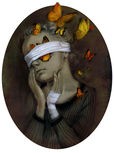
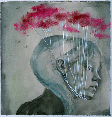
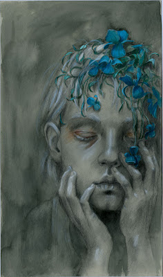
Illustration for an article about journeys in literature, more specifically, travelling in tales. It seems it usually implies some kind of prior transformation or shrinking, like Alice, or Nils Holgersson.
The technique of this one is a little messy. I've used a new paper. I'm still looking for a substitute of Grey BFK Rives. I love this paper but it's very difficult to find here. I used to buy it in one shop in Madrid, but they don't have it anymore and it's a big problem for me.
Anyway, I was not very comfortable with this new paper, which is a little more rigid than BFK. It didn't react very well to watercolor or acrylics. The positive side is that the base color is a little darker grey and so, the highlights and whites work very well on it. 
So, as far I remember this is done with pencil, watercolor, acrylic, felt tip pen (water-based) and faber-castell pitt pen (not water based). And then color added in the computer.
A mess, like I've said. It's a miracle it has worked somehow.
Oh, yes, they're pheasants. I don't know why.

final work

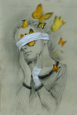
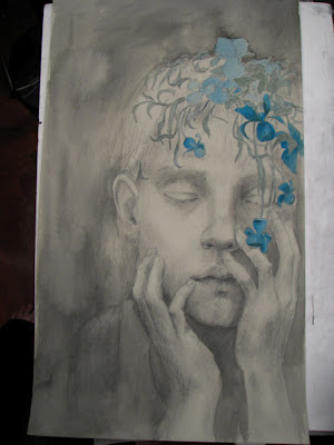
original work finished
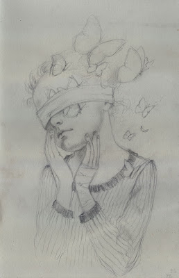
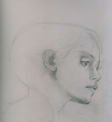
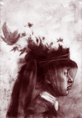
wash


Ghosts

Illustrations for a compilation of ghost tales published by Oxford University Press España. These images belong to Daniel Defoe's "The Apparation of Mrs. Veal".
Graphite on Polyester. Color and textures slightly modified digitally.


Labyrinth


Illustration for an article about Kafka.
The original drawing is pencil on polyester. Color added by computer.